Feeds:
Posts
Comments

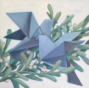
Oh mann! (my last name is Mann, get it?) I’ve been neglecting my posting too long and have much catching up to do. I will do it. Foremost thing I must announce is this (seeing that there’s a time limit) – the online show going on! It lasts only until November 21, so be quick! The theme was “All Things Good Report and Praiseworthy,” which is plenty obscure enough that you can basically see art of any kind in the show. Lots of amazing artists were chosen to participate, and there are beautiful landscapes, abstract works, LDS subjects, still lifes, etc. And of course, I have a few things in the show too. These are the ones I entered.

Another Testament (boston show) On Top Hill Cumorah (boston show) Rocks in the Grove (small)

Part of the funds received will go towards scholarships for student artists and other aspiring artists. So it’s for a good cause too! Here’s the link.

http://mormon-art-show.myshopify.com/

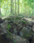
Sidenote: The newest one among these is my painting entitled “Another Testament.” It shows a peaceful scene of the future Book of Mormon in it’s place on the Hill Cumorah, before Joseph Smith took them. I walked around this sacred hill many a times during my mission in Palmyra and used personal photo reference and memories to capture this fall landscape.

*If by any chance you miss the online show that ends November 21, please contact me if you are interested in purchasing these or any other paintings.

Art Sale!

This summer while I was living in Wyoming, one of my biggest accomplishments was organizing and holding an art show.  I did it in conjunction with Cowley’s Days/the Pioneer Festival in Cowley, WY.  I would say that it was a grand success! At least, they now want to make it a tradition and have an art show annually.  We will have to see if the wind takes me back there this next summer.

In the meantime, here are some of the leftover paintings I completed for the show. If you feel like you can do so while staying true to your own art self, I think it is important to cater to your audience. Since I love painting pretty much anything (like really), I tried to focus on Wyoming landscapes, still lives, and lds art for the good Wyoming folk. There are also come Utah landscapes squeezed in there though. If you are interested in a piece, leave a comment or email me at brookemweber@gmail.com. Don’t be scared! Most are on sale right now.

Rocks in the Grove (small)

Oops! I realized I haven’t posted in a while, so I’ll start being better. I try to post at least once every month. Anyway, here’s an oil painting (roughly 15×19) of a scene in a grove of trees  in upstate New York. I painted it from photo reference, which is generally accepted to be easier than from life. A lot of artists will look down on painting from a photo. Cameras will to some extent “translate” what we see for us, so we lose some of that liberty to do so ourselves as artists. Colors, light, form – much of this is compromised in a photo. If you paint from life enough however, you can probably use some of that experience to supplement a photo painting.  I prefer painting from photos because I find that when I paint from life I go way too fast and can’t take my time on detail at all. But I certainly agree that it’s very necessary skill to be able to paint from life, so basically, do both! Find your own method.

If you’d  like to know more about the location of this painting, see my post from my other blog: themakershands.wordpress.com

I am planning on sending some of my children’s book stuff in to a publisher for review soon (I am not in any way published yet), and so I had to make a real life children’s book dummy! I remember learning about making them in one of my BYU classes, but how well does anything stick if you don’t practice it after years? (Let’s be honest) Therefore, I had to do some refreshing research for some minor details, and after a fair amount of work, voila!


IMG_5004IMG_5001


Let me tell you though – a dummy is supposed to be just a rough version to indicate what a finished book might look like, so it should be a lot easier then, right? WRONG. It’s a TON of work! Planning, planning, organizing, composing, etc. etc. Then after all your spreads are mapped out, you still have to print it in the correct order so that it works when it’s all folded. Then, you must sew it together as well.  Here is what I did just in case anyone was searching for answers like I was . . .

1.I divided the text onto pages based on what I’d like to illustrate (Usually 32 pages in a book including title page (s), copyright, etc)

2. Did thumbnail sketches of the pages

3. A little tighter rough sketches in photoshop that display the composition and pacing of each spread (I like that on photoshop you can budge and alter without redoing the whole sketch)

4. Numbered all the pages and added the typed text in the appropriate spots

5. Then I printed it in the most absurd order so that I could stack all the spreads and fold it just once (like a taco). Another option would be to make multiple folds that you would then have to sew together and make a jacket for . . . which was too complicated for me. I’m no book binder.

FullSizeRenderThis is how the pages ended up being aligned. Print the pages in these combinations and you should be able to fold it all in order.

6. Sew time! I used my biggest needle and floss. I believe the thread just needs to be waxed for strength. The best explanation I can give is this video that I used. Basically, just make an odd number of evenly spaced holes down the spine to start off, then sew in and out through them. The more holes you have the stronger.  I used 5 holes, and I also opted out of the extra jacket.

IMG_5002 IMG_5003

7. I glued the blank sides of the pages together and trimmed the edges so it all looked even. The End! So easy right? Ha ha.

They Did All Eat (smaller)

This is my most recent project, and woo! It was fun. I really enjoyed mixing my two audiences – the religious folk and the youngun folk. The style is clearly more stylized for children, although I think it can appeal to the grown-ups too. I’m wondering if I should use this style/medium more because I liked the process and results so much. I used a permanent black pencil for the lines, and the rest was gouache paint.

The subject is, of course, Jesus Christ feeding the multitudes (story found in Matthew 15).

FullSizeRenderFullSizeRender_1

My friend moved intoFullSizeRender_2 
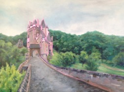
a new home with lots of blank walls –> art commission for Brooke! And what’s more, I was able to paint a beautiful European landscape with a castle for it!

She started off by showing me various photos, and I had the freedom to piece them together and create my own composition. After compiling a master photo for reference in Photoshop, I got the approval and began to paint. Like other projects, I started with a drawing then moved on to an acrylic layer. I find this step particularly important when painting on large surfaces (this was a 30×40). If you don’t have the basic colors already put down, you often have to cake oil paint on to make it opaque enough (and oil paint is more expensive than acrylic paint). This painting took me about a week and was delivered right in time for Christmas.

Fun project! Happy days!

Burg Eltz painting

A Season of Giving

We have come to a very special time of year when people tend to be (or should be) a little kinder, a little more grateful, and also maybe a little more cheerful. You have probably already seen the two origami “12 Days of Christmas” paintings I did to help commemorate the season, but this one is special in a different way.  First of all, I did it in a completely different medium (I drew it in pencil, scanned it in, and colored it digitally), but it also was created for the purpose of reminding people of the meaning behind this season and to encourage charity. I call it “Charity from a Child.” I think there is something beautiful about the selflessness and kindness young children often show. Where do we lose that innocence? I hope we can all be a little better, myself included.

Charity from a Child

This is the couple of my previous “Partridge in a Pear Tree” origami piece. Maybe a little more unrecognizable, but that’s where the title comes in to clarify . It’s called “Two Turtle Doves”! Now there you go. Both are oil on panel.

I decided to photograph some of the main steps as I did this one…

1. I always start off any serious project with sketches for composition and sketches for color. If I have a good color comp, it makes the painting go  so easy. I’m not fiddling around with color anymore because I already know what I want. In this case, I really wanted an overall blueish painting, as my partridge was overall yellow.

2. Then I follow my sketchbook sketches and sketch out my painting on the surface I chose (this one is a gessoed wood panel)

3. I did a blue acrylic wash to encourage color harmony before I started painting.

4.Next is some rough acrylic painting. I know I don’t have to get all the details in perfectly because I am going to go over it with oils. It’s a lot easier to get those smooth blends in oil painting than acrylic anyway. So I am just getting the main colors in – that way if I don’t paint all my oil layer completely opaque, the color showing through works.

5. Oil time! I started off similarly to my acrylic layer by doing a blueish/whiteish glaze over the whole thing, just to make it wet (I used Liquin, which dries kinda fast). I prefer starting with painting wet into wet to make easier blending. I started building layers upon layers with different glazes and smaller and smaller brushes…

6. Then I finished off the smallest details with the most opaque of oils and painting wet on dry. Voila! (you may have to wait a day before you can paint on dry surface) It is finished!

provo canyon 14

It’s fall time in Provo, and it couldn’t be more beautiful! October has gotta be the best month of the year here. The weather is gorgeous, the trees are gorgeous, it’s all just gorgeous! And what better way to enjoy the outdoors than plein air painting? It’s been a long time. I went up Provo Canyon just a little ways yesterday and painted alongside the fishermen by Vivian Park. I can’t say I fully captured the beauty up there right now, but hopefully you get the gist. Now I remember why my plein air painting class at BYU was my favorite. If there are other art projects that require you to be outside, I’d like to know because it’s the most peaceful and therapeutic combination.

2014-10-08 15.33.31

Patridge (small)

I am working on a few Christmas art pieces and was struggling to think of a piece that is considered Christmas-y, but also can be enjoyed all year round. THIS is one of the results! Japanese style 12 days of Christmas! I quite like my Japanese heritage, and I know others enjoy Japanese things too. Who doesn’t love origami? …Right? 🙂

It’s a 10×10 oil on board in case you were interested.